Context
This dataset is originally from the National Institute of Diabetes and Digestive and Kidney Diseases. The objective of the dataset is to diagnostically predict whether or not a patient has diabetes, based on certain diagnostic measurements included in the dataset. Several constraints were placed on the selection of these instances from a larger database. In particular, all patients here are females at least 21 years old of Pima Indian heritage.
Content
The datasets consists of several medical predictor variables and one target variable, Outcome. Predictor variables includes the number of pregnancies the patient has had, their BMI, insulin level, age, and so on.
Acknowledgements
Smith, J.W., Everhart, J.E., Dickson, W.C., Knowler, W.C., & Johannes, R.S. (1988). Using the ADAP learning algorithm to forecast the onset of diabetes mellitus. In Proceedings of the Symposium on Computer Applications and Medical Care (pp. 261–265). IEEE Computer Society Press.
Inspiration
Can you build a machine learning model to accurately predict whether or not the patients in the dataset have diabetes or not?
Multivariate data analysis is a set of statistical models that examine patterns in multidimensional data by considering, at once, several data variables. It is an expansion of bivariate data analysis, which considers only two variables in its models. As multivariate models consider more variables, they can examine more complex phenomena and find data patterns that more accurately represent the real world.
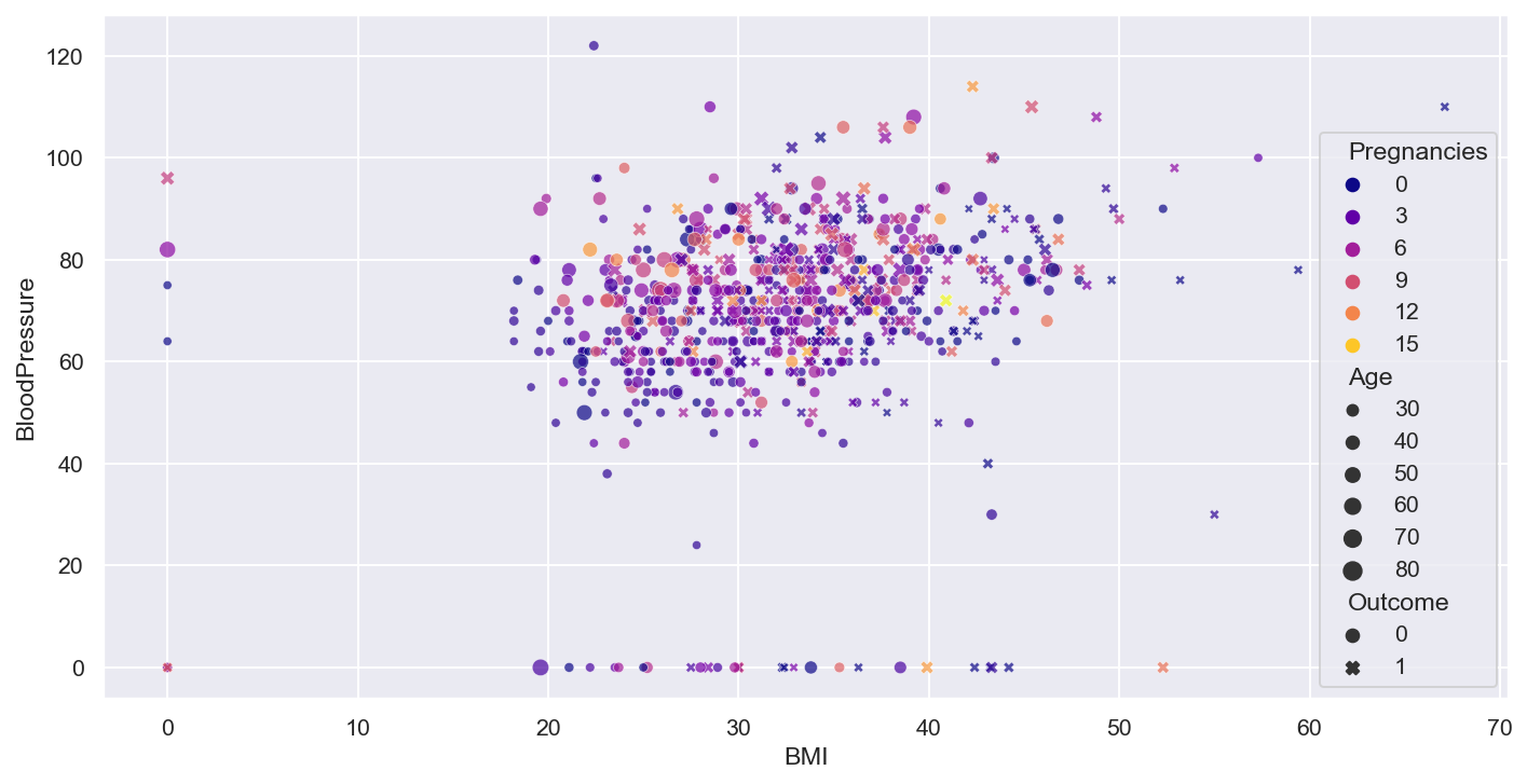
- Rough idea about the relation between variables through the scatter plot, need correlation matrix for better understanding
plt.figure(figsize=(12,6), dpi=140)
num_col1 = 'BMI'
num_col2 = 'BloodPressure'
target= 'Outcome'
cat_num_col1='Pregnancies'
cat_num_col2 ='Age'

sns.scatterplot(x=num_col1, y=num_col2, data=df,
                style=target, hue=cat_num_col1,
                size=cat_num_col2, alpha=0.7, palette = 'plasma',
)#,sizes=(20,100), hue_norm=(0,15))
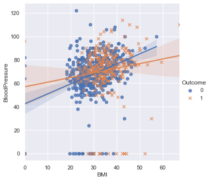
- Rough idea about the relation between variables through the scatter plot, need correlation matrix for better understanding
plt.figure(figsize=(12,6), dpi=140)
num_col1 = 'BMI'
num_col2 = 'BloodPressure'
target= 'Outcome'
cat_num_col1='Pregnancies'
cat_num_col2 ='Age'

sns.lmplot(x=num_col1, y=num_col2, markers=['o','x'], hue=target, data=df, fit_reg=True)
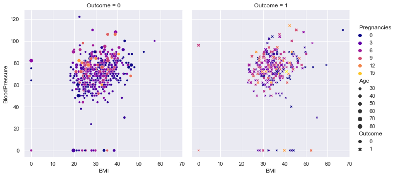
num_col1 = 'BMI'
num_col2 = 'BloodPressure'
target= 'Outcome'
cat_num_col1='Pregnancies'
cat_num_col2 ='Age'

sns.relplot(
    data=df, x=num_col1, y=num_col2,
    col=target, hue=cat_num_col1, size=cat_num_col2, style = target,palette = 'plasma',
    kind="scatter"#,aspect=0.5, height=12
)
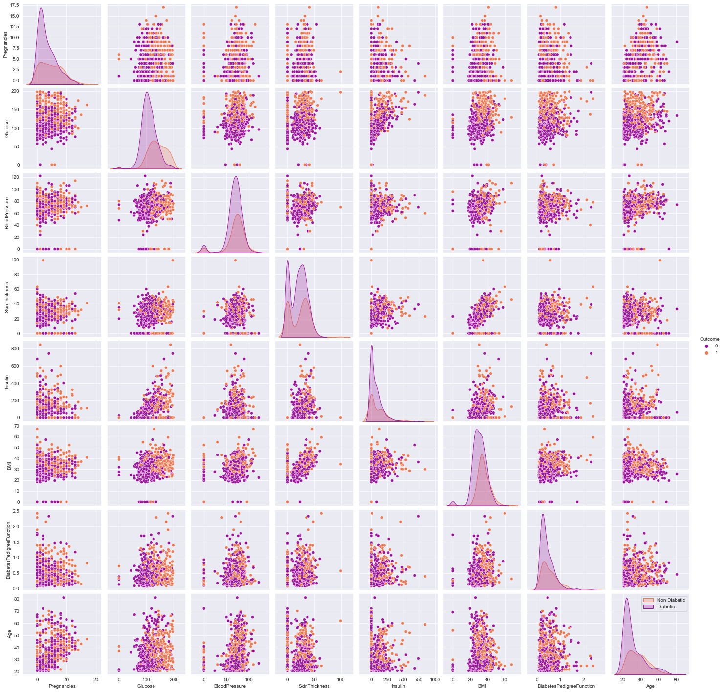
- Observe the distribution for skewness and outliers in the diagonal of the pair plot.
- Rough idea about the relation between variables through the scatter plot, need correlation matrix for better understanding
plt.figure(dpi=140)
sns.pairplot(df)
plt.show()
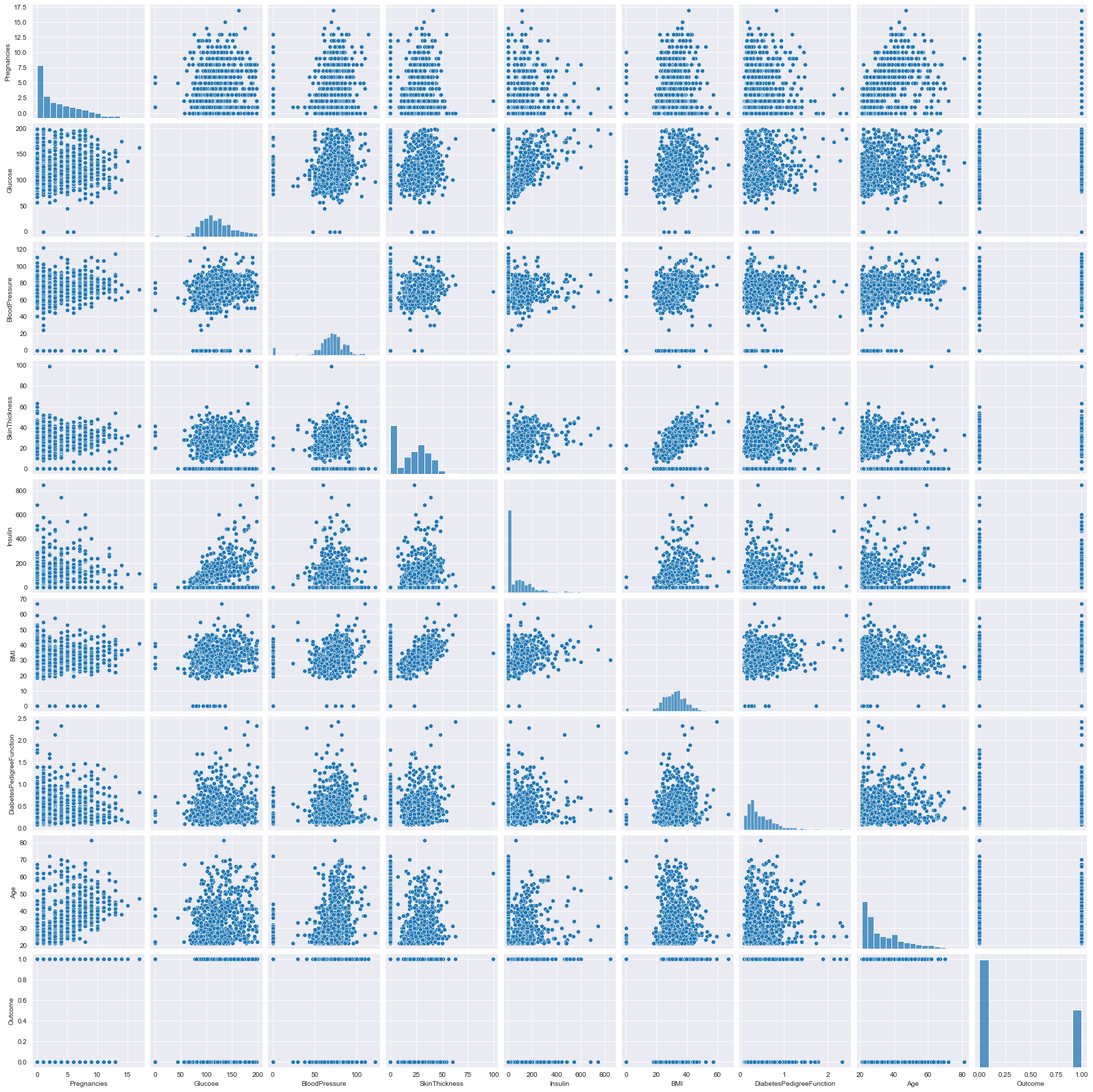
- Observe the various scatter plots for linear seperability to hypothesize linear/non-linear model
- the density curve on the diagonal point normality of the variables, in this example skewness exist, can be due to outliers, (can try to remove them and re-plot)
plt.figure(dpi = 140)
sns.pairplot(df,hue = 'Outcome',palette = 'plasma')
plt.legend(['Non Diabetic','Diabetic'])
plt.show()
sns.kdeplot(data=df, x=num_col1, y=num_col2, hue=target,fill=True,alpha=0.5,palette = 'plasma')
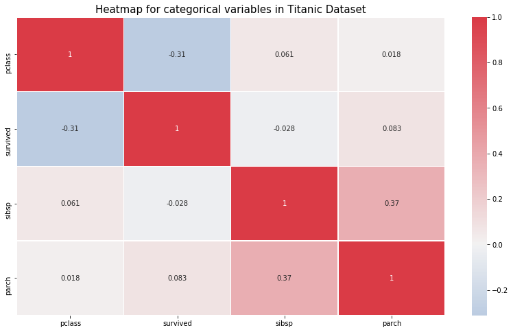
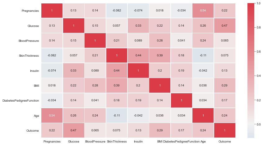
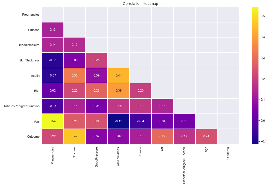
- All correlations less than or around 0.5. Therefore, Not very strong linear correlations.
plt.figure(figsize= (14,8))
# cmap=sns.diverging_palette(5, 250, as_cmap=True)
cmap = sns.diverging_palette(250, 10, as_cmap=True)
ax = sns.heatmap(df.corr(),center = 0,annot= True,linewidth=0.5,cmap= cmap)
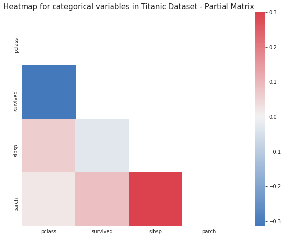
corr = df.corr()
plt.figure(figsize=(14,8))
cmap=sns.diverging_palette(5, 250, as_cmap=True)
mask = np.zeros_like(corr)
mask[np.triu_indices_from(mask)] = True
with sns.axes_style("white"):
    ax = sns.heatmap(corr, mask=mask, vmax=.3, square=True,cmap=cmap,center = 0,annot=True)
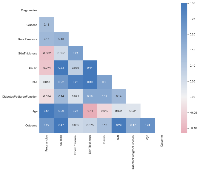
plt.figure(dpi = 80,figsize= (14,8))
mask = np.triu(np.ones_like(df.corr(),dtype = bool))
sns.heatmap(df.corr(),mask = mask, fmt = ".2f",annot=True,lw=1,cmap = 'plasma')
plt.yticks(rotation = 0)
plt.xticks(rotation = 90)
plt.title('Correlation Heatmap')
plt.show()
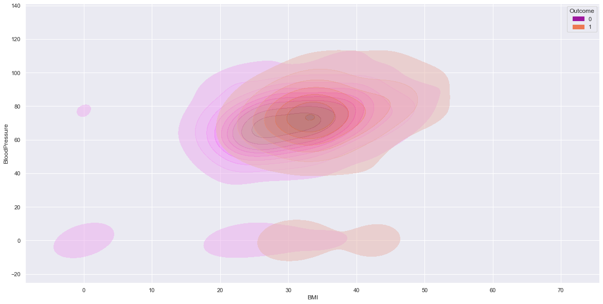
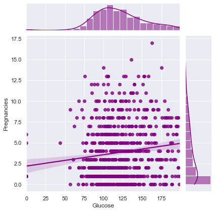
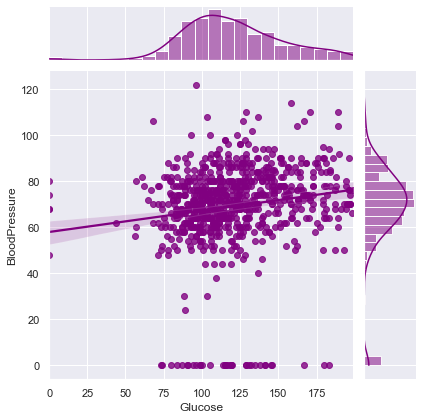
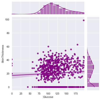
- Dig deeper for each variable and its association with other variables.
- in this example,
plt.figure(dpi = 100, figsize = (5,4))
comparsion_variable = 'Glucose'
target = 'Outcome'
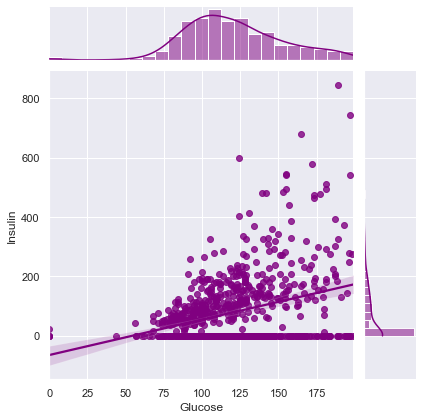
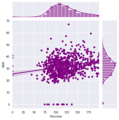
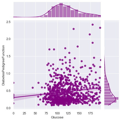
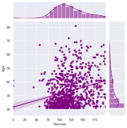
print("Joint plot of {} with Other Variables ==> \n".format(comparsion_variable))
for i in df.columns:
if i != comparsion_variable and i != target:
print(f"Correlation between {comparsion_variable} and {i} ==> ",df.corr().loc[comparsion_variable][i])
sns.jointplot(x=comparsion_variable,y=i,data=df,kind = 'reg',color = 'purple')
plt.show()
Joint plot of Glucose with Other Variables ==>

Correlation between Glucose and Pregnancies ==>  0.129458671499273
Correlation between Glucose and BloodPressure ==> 0.15258958656866448
Correlation between Glucose and SkinThickness ==> 0.057327890738176825
Correlation between Glucose and Insulin ==> 0.3313571099202081
Correlation between Glucose and BMI ==> 0.22107106945898305
Correlation between Glucose and DiabetesPedigreeFunction ==> 0.1373372998283708
Correlation between Glucose and Age ==> 0.26351431982433376
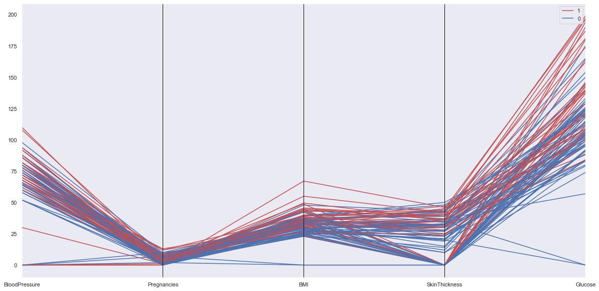
from pandas.plotting import parallel_coordinates

numeric_cols = ['BloodPressure','Pregnancies','BMI','SkinThickness','Glucose',target]

tdf = df.sample(100)

parallel_coordinates(tdf[numeric_cols], target, color = ['r','b'])
- https://www.kaggle.com/ravichaubey1506/multivariate-statistical-analysis-on-diabetes/notebook
- https://seaborn.pydata.org/generated/seaborn.scatterplot.html
- https://www.kaggle.com/princeashburton/multivariate-plotting