%matplotlib inline
sns.set_style('darkgrid')
Content
- About the dataset
- Line Plot
- Plot Multiple time series
- Seasonal and trend Components
- Check stationarity visually using rolling mean
- References
About the dataset
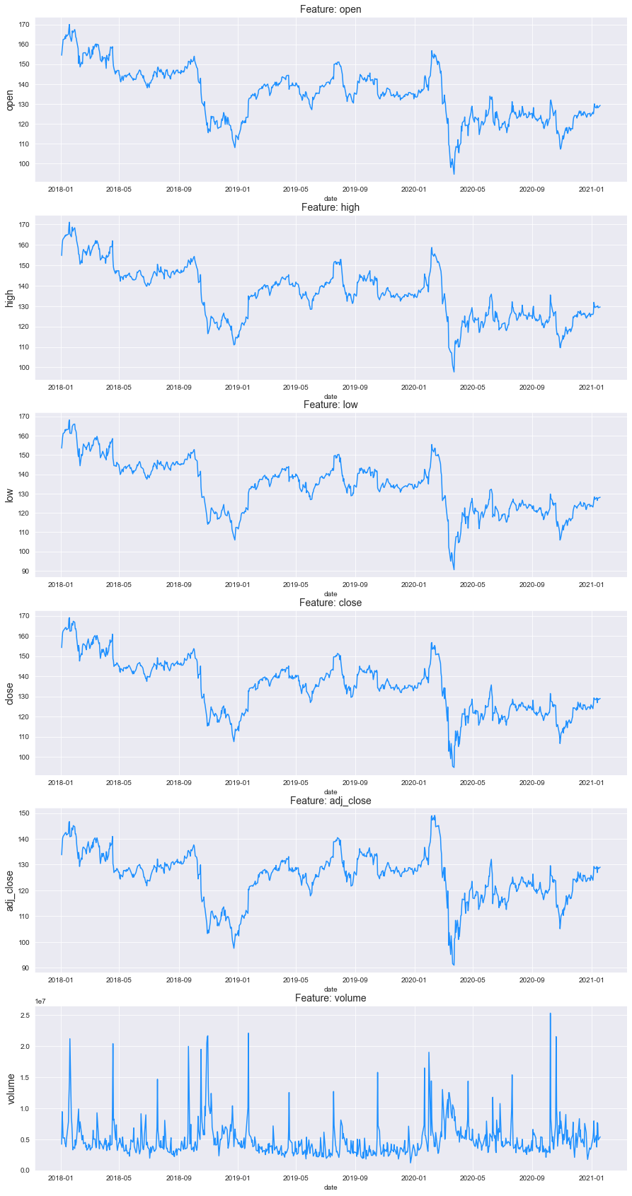
This dataset is originally from the yahoo finance website. For IBM company, ‘open’, ‘high’, ‘low’, ‘close’, ‘adj_close’, ‘volume’ data.
Line Plot
f, ax = plt.subplots(nrows=6, ncols=1, figsize=(15, 30))

for i, col in enumerate(df.drop('date', axis=1).columns):
    sns.lineplot(x='date', y=col,data=df, ax=ax[i], color='dodgerblue')
    ax[i].set_title('Feature: {}'.format(col), fontsize=14)
    ax[i].set_ylabel(ylabel=col, fontsize=14)
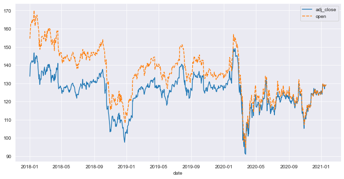
Plot Multiple time series
plt.figure(figsize=(12,6))
sns.lineplot(data=df[['adj_close','open','date']].set_index('date'))
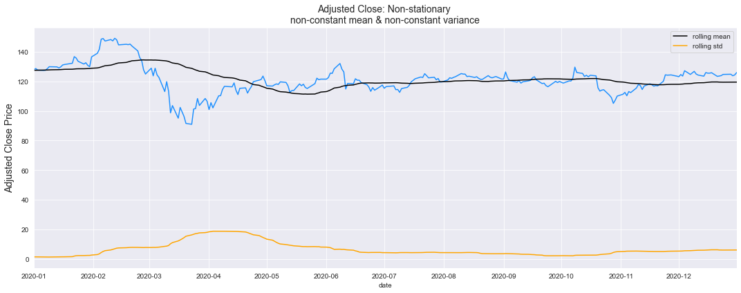
Check stationarity visually using rolling mean
# A year has 52 weeks (52 weeks * 7 days per week) aporx.
rolling_window = 52
f = plt.figure(figsize=(15, 6))
ax = plt.gca()

sns.lineplot(x=df['date'], y=df['adj_close'], color='dodgerblue')
sns.lineplot(x=df['date'], y=df['adj_close'].rolling(rolling_window).mean(),  color='black', label='rolling mean')
sns.lineplot(x=df['date'], y=df['adj_close'].rolling(rolling_window).std(), color='orange', label='rolling std')
ax.set_title('Adjusted Close: Non-stationary \nnon-constant mean & non-constant variance', fontsize=14)
ax.set_ylabel(ylabel='Adjusted Close Price', fontsize=14)
ax.set_xlim([pd.to_datetime('2020-01-01', format='%Y-%m-%d'), pd.to_datetime('2020-12-31', format='%Y-%m-%d')])

plt.tight_layout()
plt.show()
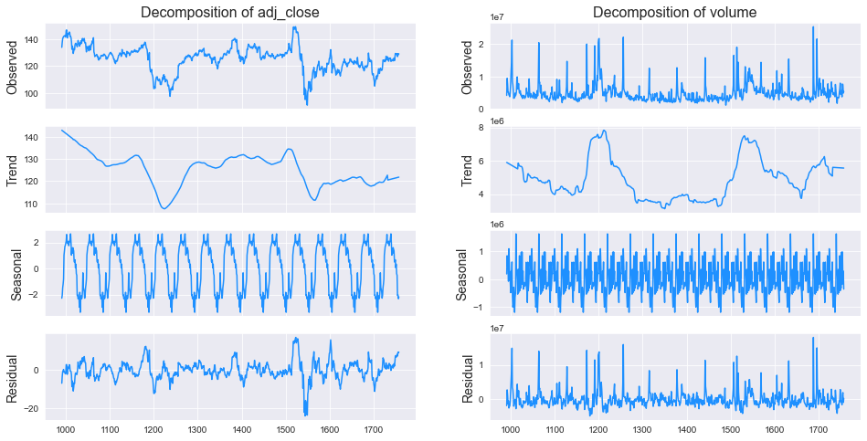
Seasonal and trend Components
from statsmodels.tsa.seasonal import seasonal_decompose

core_columns =  ['adj_close','volume']

for column in core_columns:
    decomp = seasonal_decompose(df[column], period=52, model='additive', extrapolate_trend='freq')
    df[f"{column}_trend"] = decomp.trend
    df[f"{column}_seasonal"] = decomp.seasonal
fig, ax = plt.subplots(ncols=2, nrows=4, sharex=True, figsize=(16,8))

for i, column in enumerate(['adj_close', 'volume']):

    res = seasonal_decompose(df[column], freq=52, model='additive', extrapolate_trend='freq')

    ax[0,i].set_title('Decomposition of {}'.format(column), fontsize=16)
    res.observed.plot(ax=ax[0,i], legend=False, color='dodgerblue')
    ax[0,i].set_ylabel('Observed', fontsize=14)

    res.trend.plot(ax=ax[1,i], legend=False, color='dodgerblue')
    ax[1,i].set_ylabel('Trend', fontsize=14)

    res.seasonal.plot(ax=ax[2,i], legend=False, color='dodgerblue')
    ax[2,i].set_ylabel('Seasonal', fontsize=14)

    res.resid.plot(ax=ax[3,i], legend=False, color='dodgerblue')
    ax[3,i].set_ylabel('Residual', fontsize=14)

plt.show()
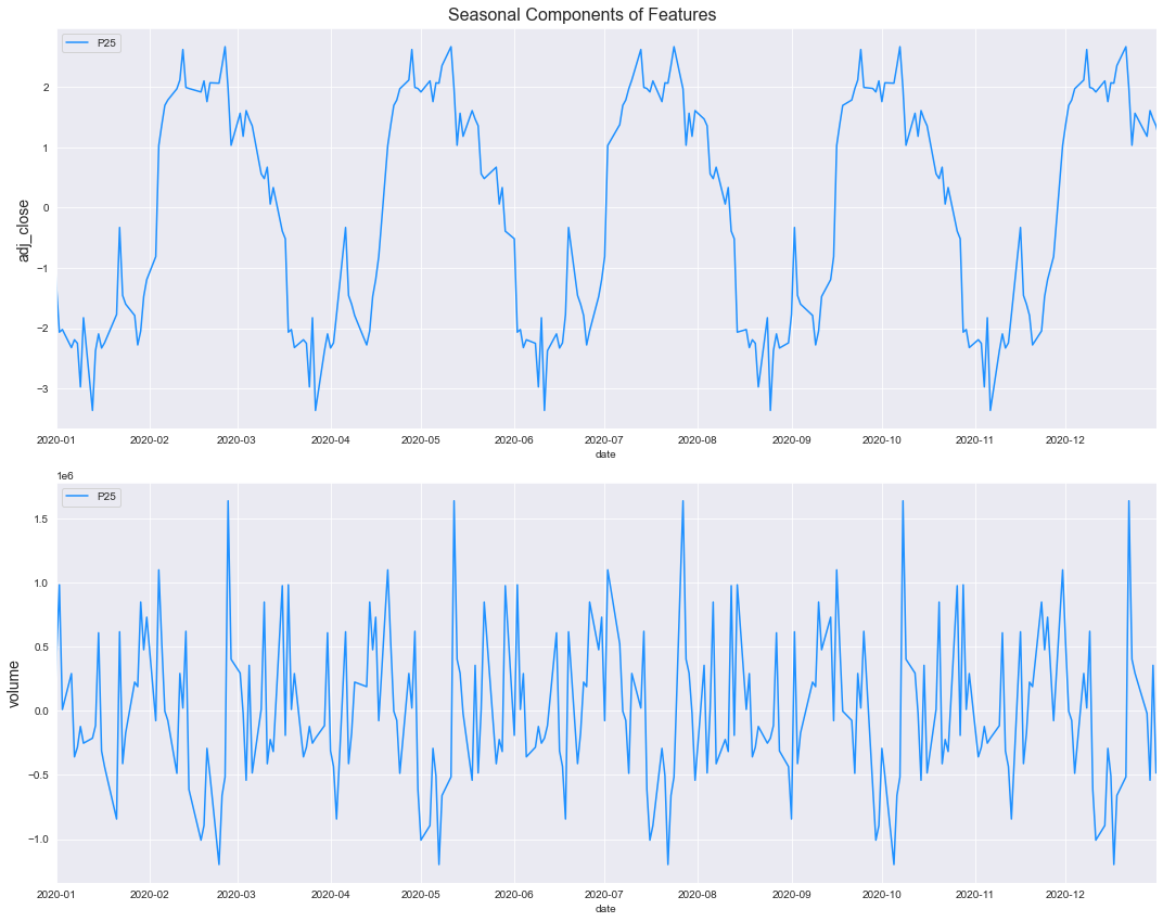
Visual analysis of Seasonality
f, ax = plt.subplots(nrows=2, ncols=1, figsize=(15, 12))
f.suptitle('Seasonal Components of Features', fontsize=16)

for i, column in enumerate(core_columns):
    sns.lineplot(x=df['date'], y=df[column + '_seasonal'], ax=ax[i], color='dodgerblue', label='P25')
    ax[i].set_ylabel(ylabel=column, fontsize=14)
    ax[i].set_xlim([pd.to_datetime('2020-01-01', format='%Y-%m-%d'), pd.to_datetime('2020-12-31', format='%Y-%m-%d')])

plt.tight_layout()
plt.show()
Refrences
- https://www.kaggle.com/andreshg/timeseries-analysis-a-complete-guide